

Square Online is a game-changer for busy small business owners! It's super easy to use, even if you're not a tech whiz. Creating a simple online ordering? Selling products or services? Smooth and simple. Plus, it works like magic with Square's payment system, making transactions a snap.
Whether you're a shop owner looking to go digital, or a café craving online orders, Square Online has got you covered. And the best part? It's all integrated, so you can manage everything in one place.
Square Online is your go-to for jumping into e-commerce without the headache. Quick-setup, easy-sales, happy-customers. What's not to love? Get online, get selling, and watch your business grow.
Read more from our head of community building at Orda.
We gathered 7 tips and best practices with e-commerce examples for Square Online store inspiration from our own community of businesses. Discover seven remarkable Square Online store examples to inspire your e-commerce journey in 2024. Explore innovative designs, effective strategies, and the latest trends to enhance your online business presence.
Use White Space like Kirtida Kitchen
Don't underestimate the power of white space on your landing page. It's not just empty space; it's a powerful design element. With Square Online, you can effectively use white space to create a clean, uncluttered look, which helps in drawing attention to key elements of your page and makes the content more digestible.
Landing Page: 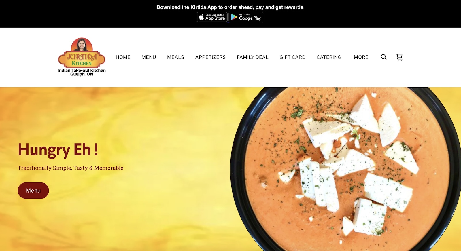
Streamline Navigations like Yellow Vase
A clutter-free, streamlined navigation is key to a great landing page. With Square Online, you can create an intuitive menu that guides visitors effortlessly through your site. Keep it simple; prioritize ease of finding information over complexity. This approach ensures that potential customers can navigate your offerings quickly, leading to a better user experience and potentially more sales.
Landing Page: 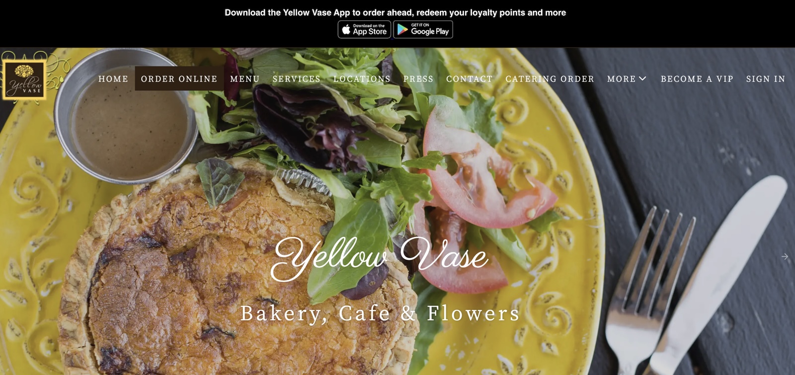
Branding and Color Scheme like Snickas!
Your landing page is the digital face of your business, and Square Online makes it easy to infuse it with your unique brand identity. Select a color scheme that resonates with your brand's ethos. Consistency in colors and design elements across the page helps in establishing brand recognition, making your business memorable and relatable to your audience.
Landing Page: 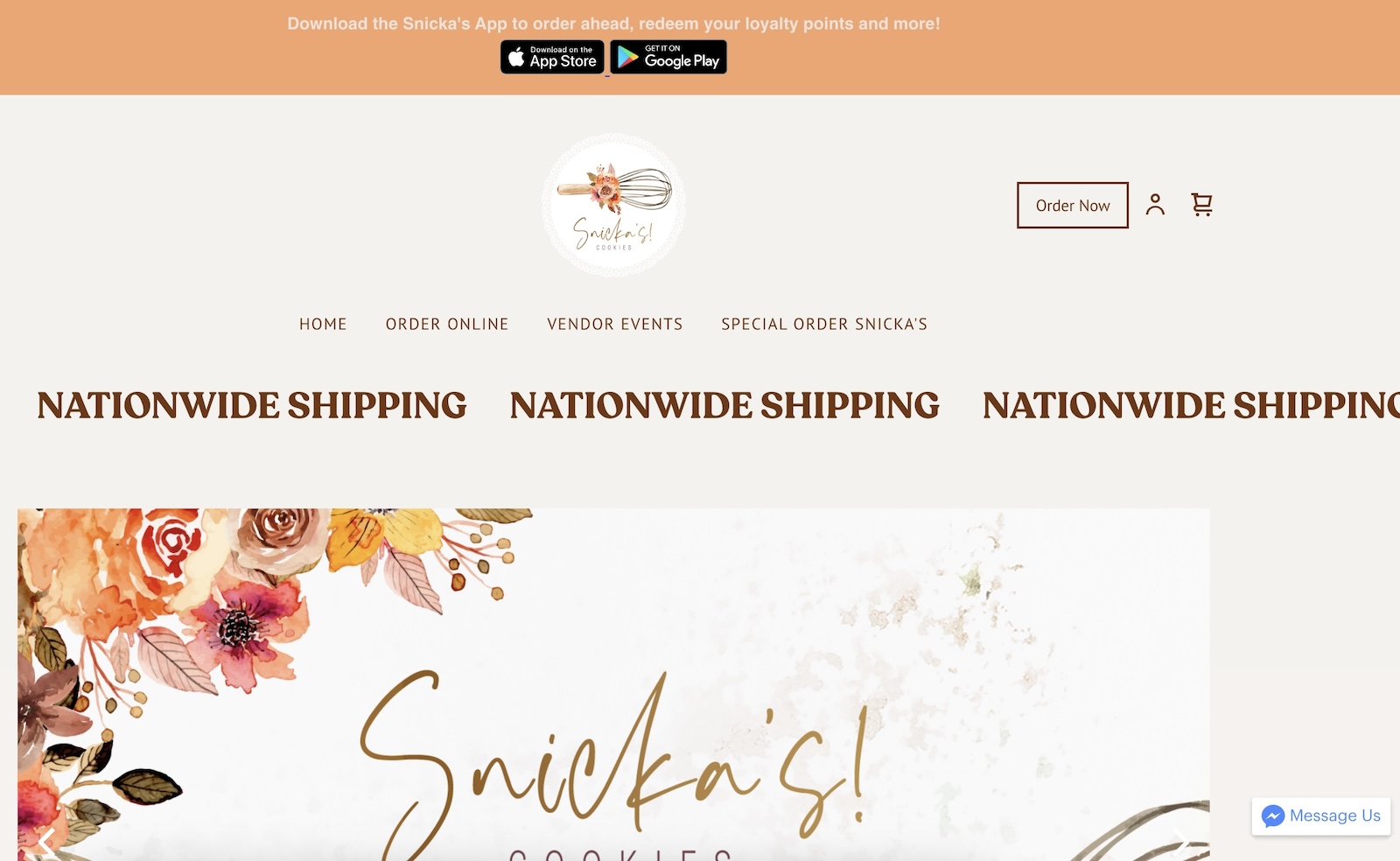
Imagery like Lil Woodys
High-quality, relevant imagery can speak volumes on your landing page. With Square Online, you can integrate visually appealing images that represent your products or services. These images should not only be eye-catching but also reflect the essence of your brand, helping to create a connection with your visitors.
Landing Page: 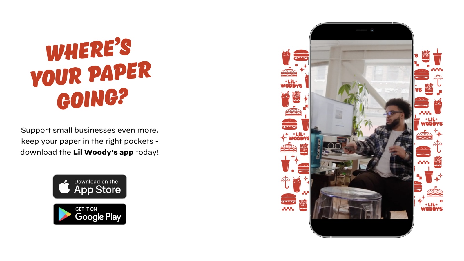
Responsive Design with Jem Juicery
Together with a mobile app that Orda provides, in today's mobile-first world, having a responsive design is non-negotiable. Square Online ensures that your landing page looks great and functions seamlessly across all devices. This adaptability enhances user experience, ensuring that your site is accessible and appealing whether it's viewed on a desktop, tablet, or smartphone.
Landing Page: 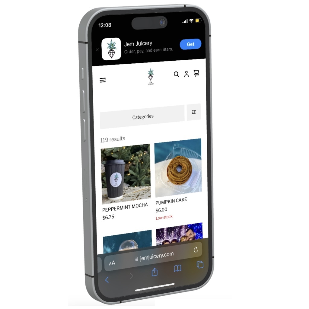
Call To Action like Brew HaHa
If your business has an app, use your landing page to encourage downloads. Square Online allows you to incorporate a prominent, persuasive call-to-action for app downloads. This CTA should be strategically placed and designed to catch the eye, nudging visitors towards downloading your app, thereby deepening their engagement with your brand.
Landing Page: 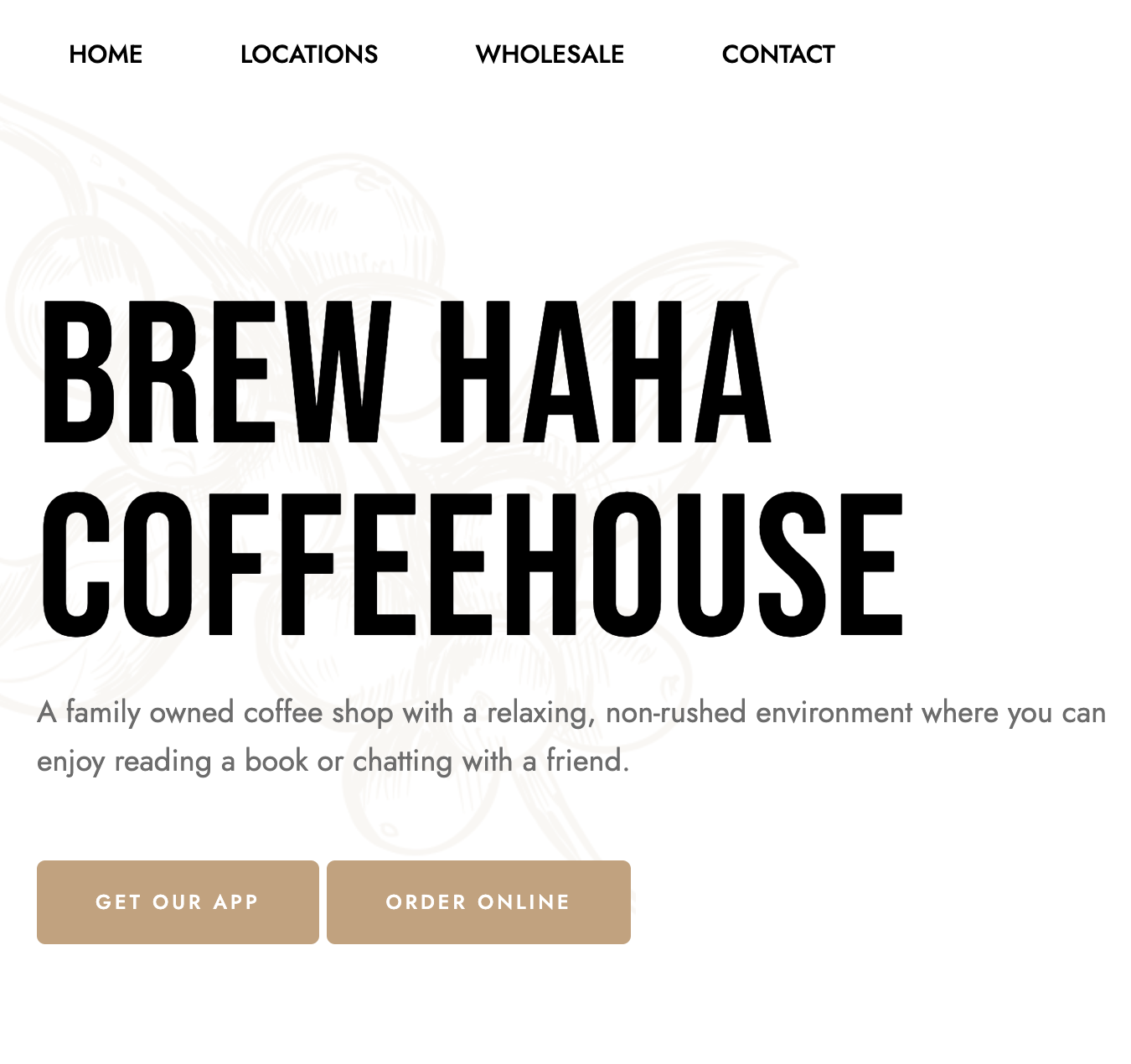
Footer Information like Keva Juice
The footer is an often-overlooked aspect of a landing page, but it's crucial. It's where visitors look for contact information, social media links, FAQs, and more. Square Online lets you customize your footer to include all essential information, making it a useful resource for visitors and a trust-building tool for your business.
Landing Page: 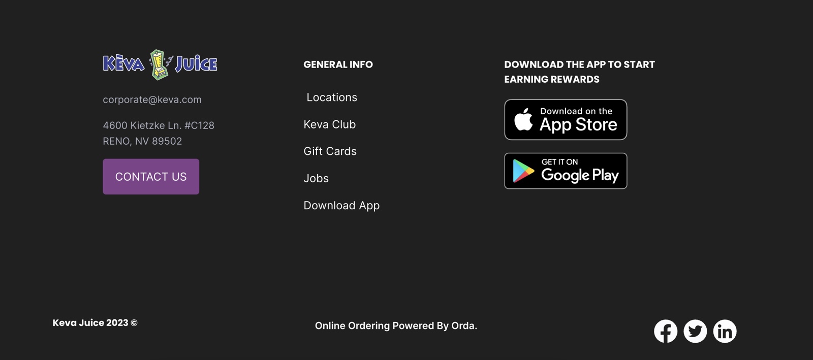
Bonus - What to Avoid when building with Square Online?
-
Cluttered Layouts: Avoid overcrowding your website with excessive content, images, or widgets. Example: Multiple pop-up ads that disrupt the user experience.
-
Too Many Fonts and Colors: Stick to a limited number of fonts and colors for a professional look. Example: A website with a mishmash of fonts and a rainbow of colors.
-
Lack of Clear Call to Action (CTA): Provide clear and compelling CTAs to guide users. Example: A website without clear CTAs, leaving visitors unsure of what to do next.
-
Inconsistent Navigation: Maintain consistent navigation menus and layout across different pages. Example: Having the navigation menu in different locations on different pages.
-
Neglecting Accessibility: Ensure your website is accessible to individuals with disabilities. Example: Failing to provide alt text for images or using inaccessible design elements.
-
Unoptimized Images and Videos: Optimize media files for faster loading times. Example: Using large, unoptimized images that slow down your site's performance.